> ## Documentation Index
> Fetch the complete documentation index at: https://docs.appreply.co/llms.txt
> Use this file to discover all available pages before exploring further.
# Reviews
> Review volume, topic distribution, and sentiment for a single app
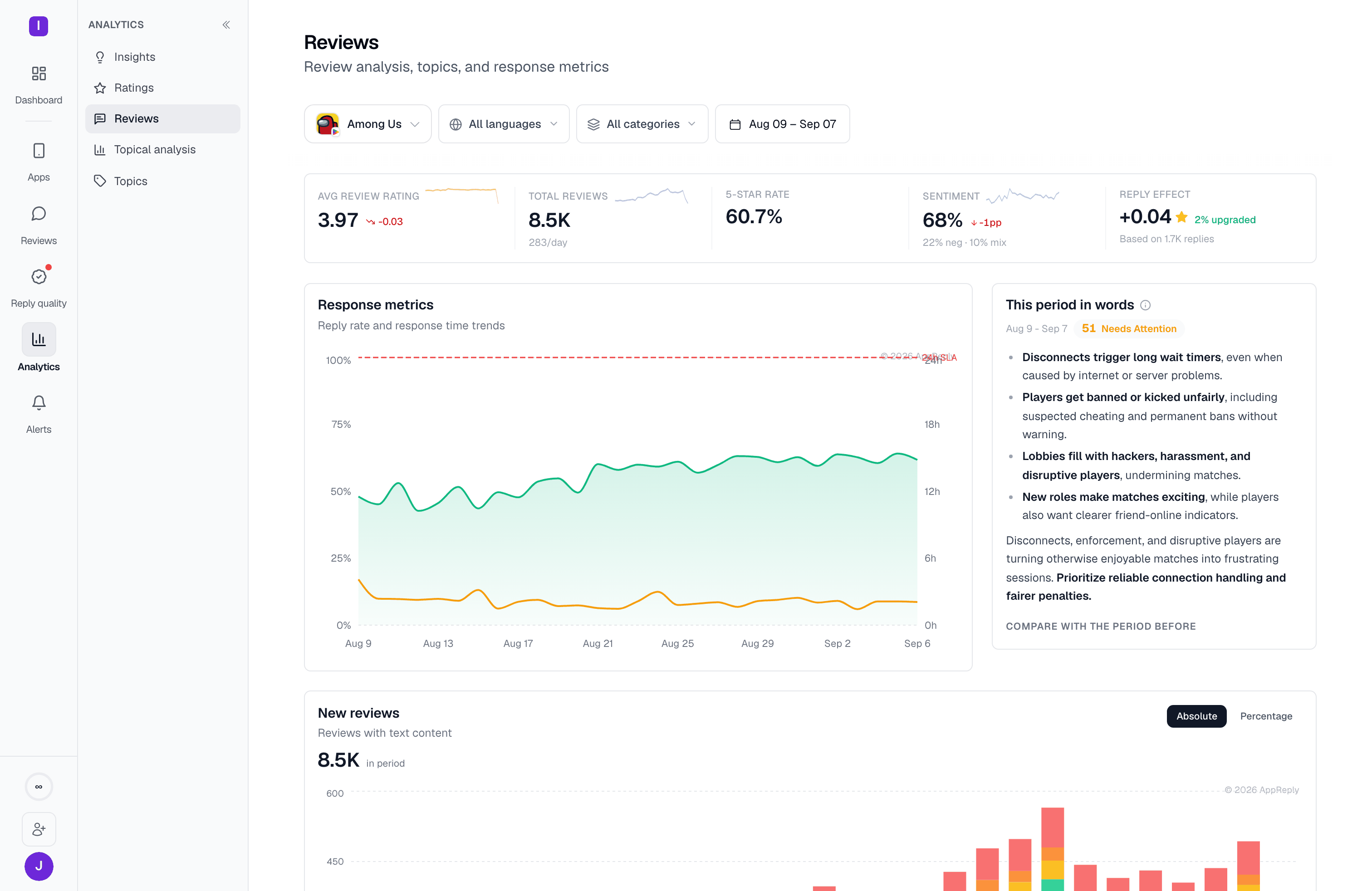
Reviews is the Analytics page that answers what a period was actually about: how many reviews came in, which topics they clustered around, and whether sentiment held up. Where [Insights](/analytics/insights) tells the story week by week, this page reports the whole window at once. Reply rate and response time charts live on [Reply performance](/analytics/reply-performance).
 Topics and sentiment are computed per app, so this page needs a single-app scope. Selecting several apps replaces it with a prompt explaining why, with one-click chips back to a single app.
## The vitals row
Five figures summarize the window, each with a sparkline and a comparison against the period before:
| Figure | What it counts |
| - | - |
| Avg review rating | The average star rating of reviews received in the window — not your store rating, which [Ratings](/analytics/ratings) covers. |
| Total reviews | Reviews with text content in the window, with a per-day average underneath. |
| 5-star rate | The share of those reviews that came in at five stars. |
| Sentiment | The share read as positive, with the negative and mixed shares spelled out beneath it. |
| Reply effect | The average star movement on reviews a reply reached, how many were upgraded, and how many replies the figure rests on. |
Sentiment and star rating measure different things and can move in opposite directions — a review can be three stars and read as constructive rather than angry. Where they disagree, sentiment is usually the earlier signal.
## Narrowing to a category or topic
The filter bar carries a **category** control alongside the app, language, and date pickers. It lists your topic categories with the number of topics in each, and narrowing to one scopes the whole page — vitals, charts, and tables together.
Topics and sentiment are computed per app, so this page needs a single-app scope. Selecting several apps replaces it with a prompt explaining why, with one-click chips back to a single app.
## The vitals row
Five figures summarize the window, each with a sparkline and a comparison against the period before:
| Figure | What it counts |
| - | - |
| Avg review rating | The average star rating of reviews received in the window — not your store rating, which [Ratings](/analytics/ratings) covers. |
| Total reviews | Reviews with text content in the window, with a per-day average underneath. |
| 5-star rate | The share of those reviews that came in at five stars. |
| Sentiment | The share read as positive, with the negative and mixed shares spelled out beneath it. |
| Reply effect | The average star movement on reviews a reply reached, how many were upgraded, and how many replies the figure rests on. |
Sentiment and star rating measure different things and can move in opposite directions — a review can be three stars and read as constructive rather than angry. Where they disagree, sentiment is usually the earlier signal.
## Narrowing to a category or topic
The filter bar carries a **category** control alongside the app, language, and date pickers. It lists your topic categories with the number of topics in each, and narrowing to one scopes the whole page — vitals, charts, and tables together.
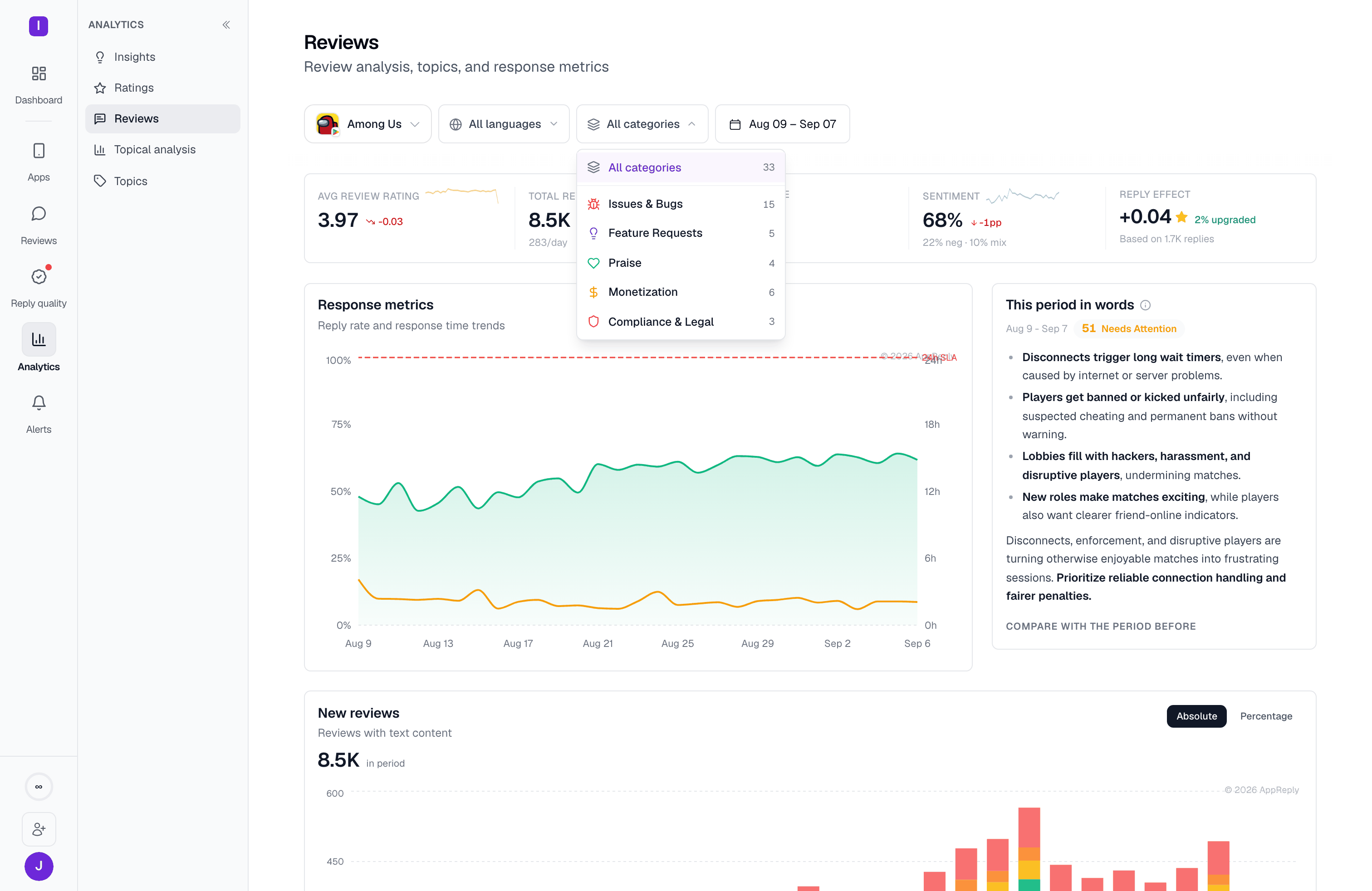 Next to it, a **topic** control (it reads **All topics** until you pick one) narrows the page to reviews carrying a single topic. It has a **Filter topics…** search box and lists topics under their category headings, each with its review count. Use it to follow one problem over time: the charts, the breakdown tables and the period summary then describe only that topic's reviews.
The two controls work together:
* With a category selected, the topic list shows only that category's topics.
* Changing or clearing the category also clears the topic.
* Both selections are kept in the page URL, so a reload or a shared link opens the same view.
The controls only appear once you've picked a single app that has topics. An app with no classified reviews yet has nothing to narrow by, so the filters stay hidden rather than opening empty.
## This period in words
On a paid plan, an AI-written summary sits in the right-hand column, beside the [New reviews](#new-reviews) chart. It carries the window's dates, a health score with a status word, three or four themes drawn from the reviews themselves, and a closing line naming what to prioritize.
**Compare with the period before** expands it into a genuine comparison: a paragraph on what changed, then **Improved** and **Regressed** lists. **Regenerate comparison** rebuilds it if the period has moved on since it was written.
Next to it, a **topic** control (it reads **All topics** until you pick one) narrows the page to reviews carrying a single topic. It has a **Filter topics…** search box and lists topics under their category headings, each with its review count. Use it to follow one problem over time: the charts, the breakdown tables and the period summary then describe only that topic's reviews.
The two controls work together:
* With a category selected, the topic list shows only that category's topics.
* Changing or clearing the category also clears the topic.
* Both selections are kept in the page URL, so a reload or a shared link opens the same view.
The controls only appear once you've picked a single app that has topics. An app with no classified reviews yet has nothing to narrow by, so the filters stay hidden rather than opening empty.
## This period in words
On a paid plan, an AI-written summary sits in the right-hand column, beside the [New reviews](#new-reviews) chart. It carries the window's dates, a health score with a status word, three or four themes drawn from the reviews themselves, and a closing line naming what to prioritize.
**Compare with the period before** expands it into a genuine comparison: a paragraph on what changed, then **Improved** and **Regressed** lists. **Regenerate comparison** rebuilds it if the period has moved on since it was written.
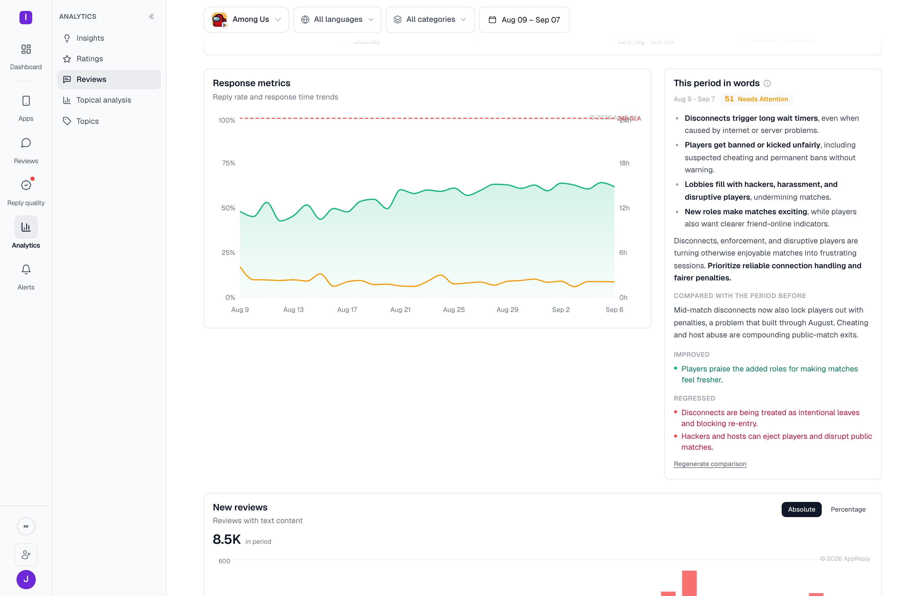 The summary reads the reviews in the current window and filters. Change the date range, the language, the category, or the topic and it describes that narrower set instead, so a summary written for one filter shouldn't be read as a statement about the app overall.
## New reviews
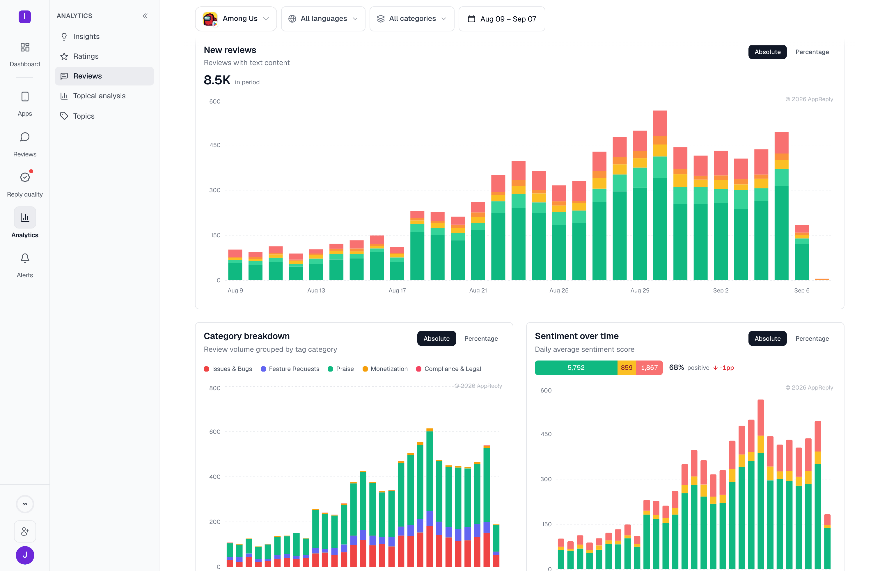
**New reviews** is the daily volume chart, at the top of the page beside the period summary: one bar per day, stacked by star rating, with the period total called out above it. When the summary isn't shown, the chart takes the full width of the row. **Absolute** and **Percentage** switch between counts and share, which matters on a window where volume swings hard: in percentage mode a quiet day and a spike are directly comparable, so you can see a rating mix worsening even while total volume falls.
The summary reads the reviews in the current window and filters. Change the date range, the language, the category, or the topic and it describes that narrower set instead, so a summary written for one filter shouldn't be read as a statement about the app overall.
## New reviews
**New reviews** is the daily volume chart, at the top of the page beside the period summary: one bar per day, stacked by star rating, with the period total called out above it. When the summary isn't shown, the chart takes the full width of the row. **Absolute** and **Percentage** switch between counts and share, which matters on a window where volume swings hard: in percentage mode a quiet day and a spike are directly comparable, so you can see a rating mix worsening even while total volume falls.
 ## Category breakdown and sentiment over time
These two sit side by side, both with their own **Absolute** / **Percentage** toggle.
## Category breakdown and sentiment over time
These two sit side by side, both with their own **Absolute** / **Percentage** toggle.
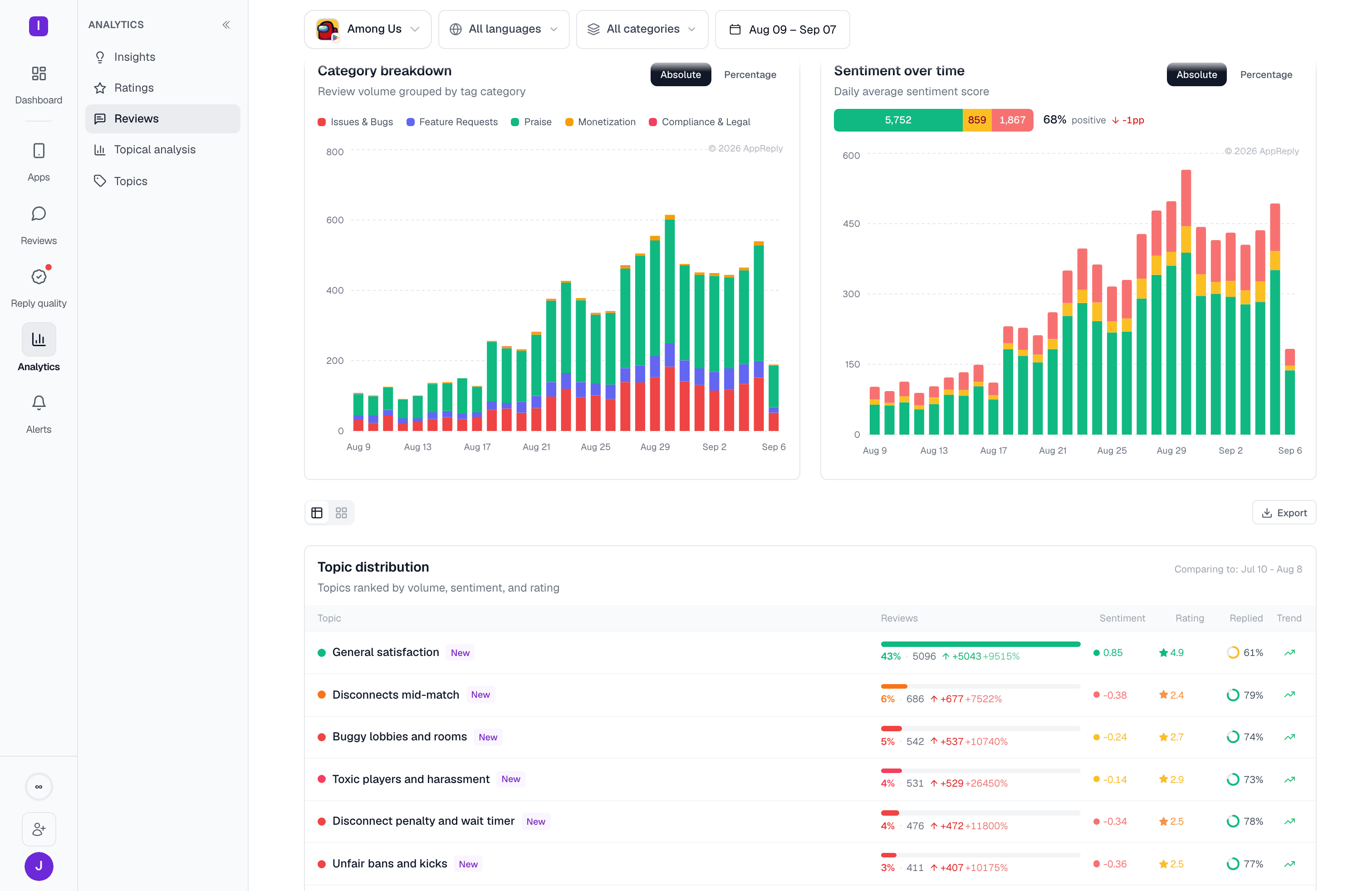 **Category breakdown** groups daily review volume by topic category, so you can see a bug wave arrive as a growing red band rather than as a dip in an average. **Sentiment over time** plots daily sentiment, with a summary bar above it splitting the window's reviews into positive, mixed, and negative counts.
## Topic distribution
Every classified topic in the window, ranked by volume. Each row carries the topic's share and review count, its change against the comparison period, sentiment on a −1 to +1 scale, average rating, the share that got a reply, and a trend arrow. The header names the period it's comparing against.
**Category breakdown** groups daily review volume by topic category, so you can see a bug wave arrive as a growing red band rather than as a dip in an average. **Sentiment over time** plots daily sentiment, with a summary bar above it splitting the window's reviews into positive, mixed, and negative counts.
## Topic distribution
Every classified topic in the window, ranked by volume. Each row carries the topic's share and review count, its change against the comparison period, sentiment on a −1 to +1 scale, average rating, the share that got a reply, and a trend arrow. The header names the period it's comparing against.
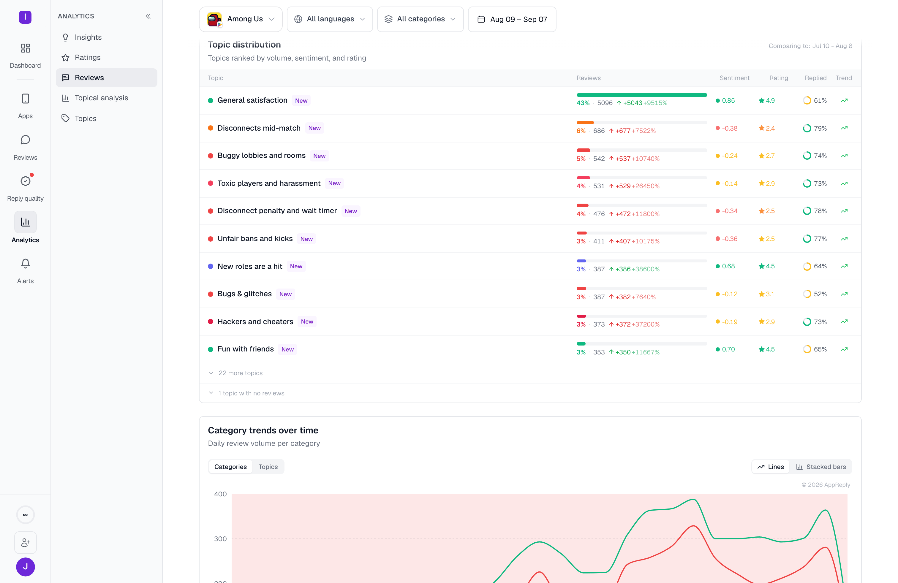 The table opens at the top ten and collapses the rest behind a **more topics** row, with topics that got no reviews in the window kept separately below that — a topic with nothing in the window is usually a resolved problem, not a missing one.
A toggle above the table switches it for a **treemap** sized by volume with a sparkline table alongside, and **Export** downloads the current table as CSV.
Click a topic's name to open its drilldown panel for the current window: an AI summary of the topic, a trend chart, a badge naming the trend and the week it describes, sample reviews, and an **Open in Reviews** link to the matching reviews in the feed. Hovering a row shows two more actions: the sparkles icon (**AI summary for this topic**) opens the same panel, and the bell (**Create an alert for this topic**) opens a new [alert rule](/review-management/alerts) with this topic already filled in.
Read the sentiment and rating columns together before acting on volume. A topic can be large and healthy — general praise usually is — while a much smaller one at −0.35 and 2.4 stars is the one costing you ratings.
## Category trends over time
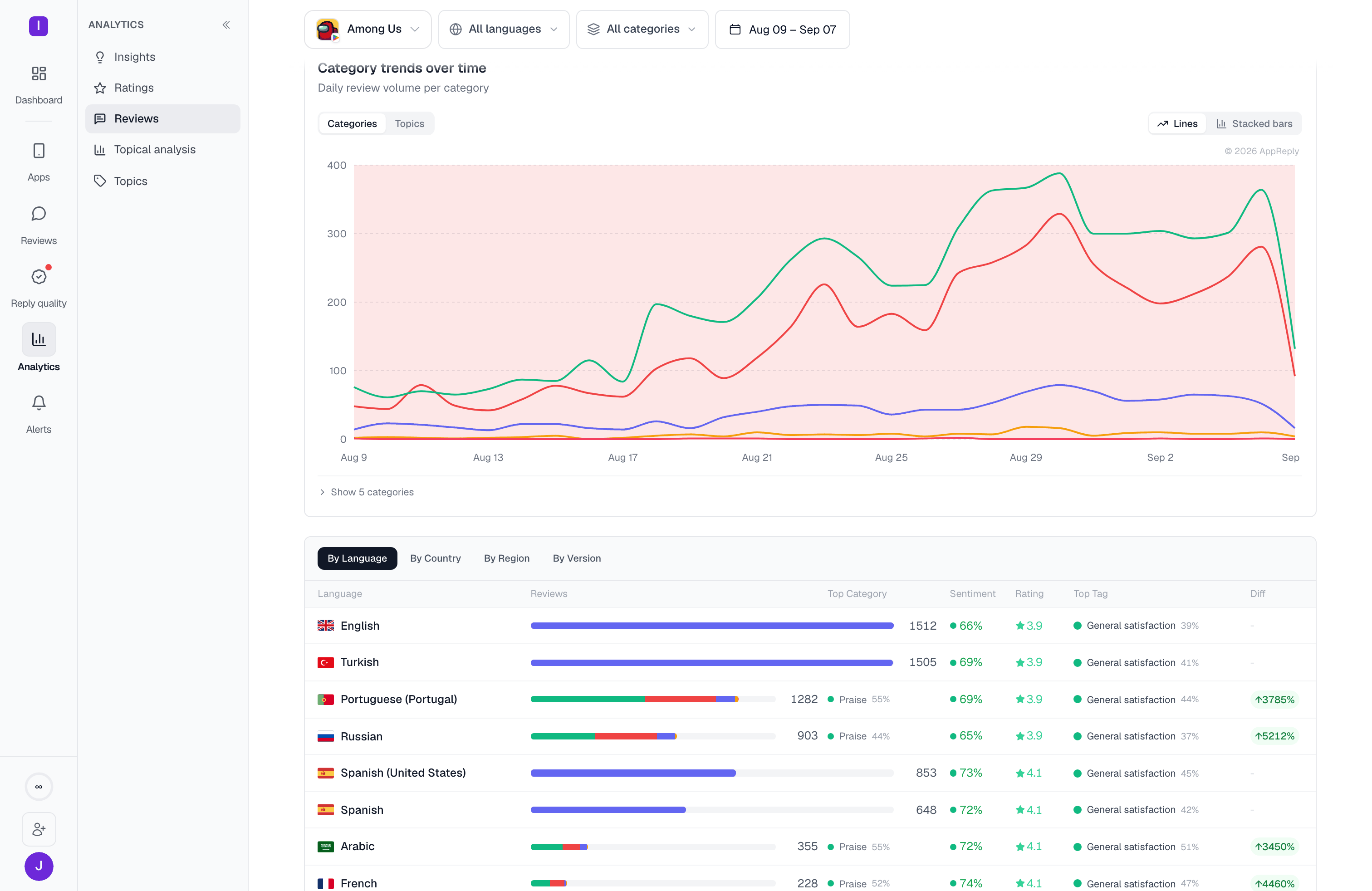
Where the category breakdown shows composition, **Category trends over time** shows movement: daily volume per category as lines, or as stacked bars. A **Topics** toggle swaps the category lines for individual topics, which is the view for watching one specific problem rise and fall. In that view, a compact topic picker (the same one as in the filter bar) narrows the chart to one topic, and the list of topics under the chart can be shown or hidden. With a topic selected in the filter bar, the chart shows only that topic, the picker is hidden, and **Categories** is unavailable until you clear the filter.
The table opens at the top ten and collapses the rest behind a **more topics** row, with topics that got no reviews in the window kept separately below that — a topic with nothing in the window is usually a resolved problem, not a missing one.
A toggle above the table switches it for a **treemap** sized by volume with a sparkline table alongside, and **Export** downloads the current table as CSV.
Click a topic's name to open its drilldown panel for the current window: an AI summary of the topic, a trend chart, a badge naming the trend and the week it describes, sample reviews, and an **Open in Reviews** link to the matching reviews in the feed. Hovering a row shows two more actions: the sparkles icon (**AI summary for this topic**) opens the same panel, and the bell (**Create an alert for this topic**) opens a new [alert rule](/review-management/alerts) with this topic already filled in.
Read the sentiment and rating columns together before acting on volume. A topic can be large and healthy — general praise usually is — while a much smaller one at −0.35 and 2.4 stars is the one costing you ratings.
## Category trends over time
Where the category breakdown shows composition, **Category trends over time** shows movement: daily volume per category as lines, or as stacked bars. A **Topics** toggle swaps the category lines for individual topics, which is the view for watching one specific problem rise and fall. In that view, a compact topic picker (the same one as in the filter bar) narrows the chart to one topic, and the list of topics under the chart can be shown or hidden. With a topic selected in the filter bar, the chart shows only that topic, the picker is hidden, and **Categories** is unavailable until you clear the filter.
 ## Breaking the window down
The last section on the page is one table with four tabs — **By Language**, **By Country**, **By Region**, and **By Version** — each splitting the same window by that dimension. Every row shows review volume, its category mix, top category, sentiment, average rating, top topic, and the change against the comparison period.
## Breaking the window down
The last section on the page is one table with four tabs — **By Language**, **By Country**, **By Region**, and **By Version** — each splitting the same window by that dimension. Every row shows review volume, its category mix, top category, sentiment, average rating, top topic, and the change against the comparison period.
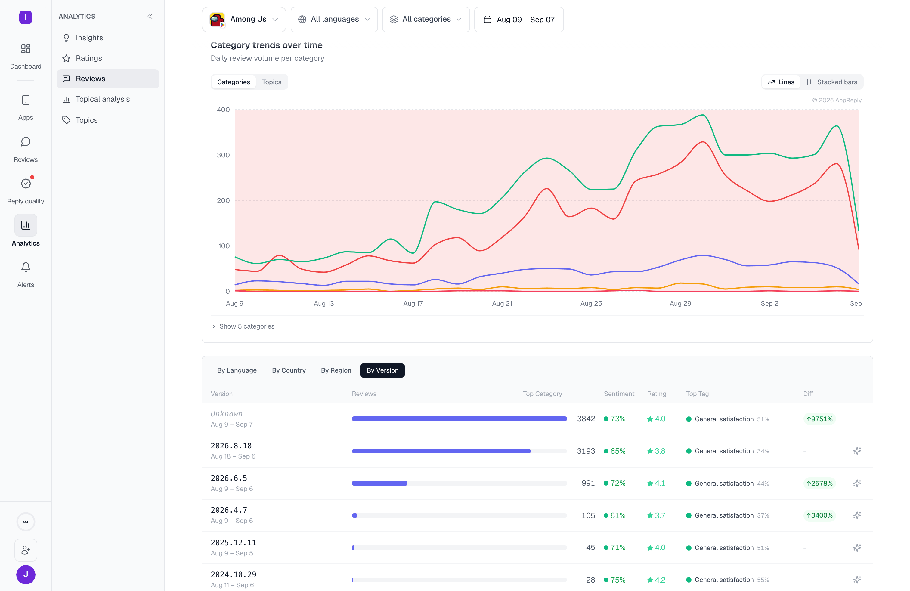 **By Version** appears only for a Google Play app, since that's where AppReply can attribute a review to an app version. Each version row carries the date span it was reviewed over, and reviews that arrived without a version resolve into an **Unknown** row rather than being dropped.
A breakdown is only as useful as its spread. If one language or country carries almost all your reviews, that tab tells you little — the interesting splits are the ones where a smaller market's sentiment or rating diverges from the rest.
Explore any topic on its own, with drilldowns to the reviews behind it
Coverage, speed, and the effect replies have on ratings, per rule and per person
**By Version** appears only for a Google Play app, since that's where AppReply can attribute a review to an app version. Each version row carries the date span it was reviewed over, and reviews that arrived without a version resolve into an **Unknown** row rather than being dropped.
A breakdown is only as useful as its spread. If one language or country carries almost all your reviews, that tab tells you little — the interesting splits are the ones where a smaller market's sentiment or rating diverges from the rest.
Explore any topic on its own, with drilldowns to the reviews behind it
Coverage, speed, and the effect replies have on ratings, per rule and per person