> ## Documentation Index
> Fetch the complete documentation index at: https://docs.appreply.co/llms.txt
> Use this file to discover all available pages before exploring further.
# Reply performance
> Coverage, speed, and the effect replies actually have on ratings — by automation rule and by person
Reply performance answers a different question than the rest of Analytics: not what reviews say, but how well they're being answered. It's reached from Analytics as **Performance**, and splits into two tabs — **AI Agents** and **Humans** — that read the same underlying reply data from two different angles.
 Both tabs require a Pro or Ultimate plan (or an active trial); other orgs see an upgrade prompt in place of the charts. The **Humans** tab is additionally visible to Admins and Owners only — Members see just the AI Agents tab, with no second tab shown.
Every number on this page is read per app and folded together, so a multi-app scope reports a true combined total rather than one app's numbers standing in for the rest.
## AI Agents tab
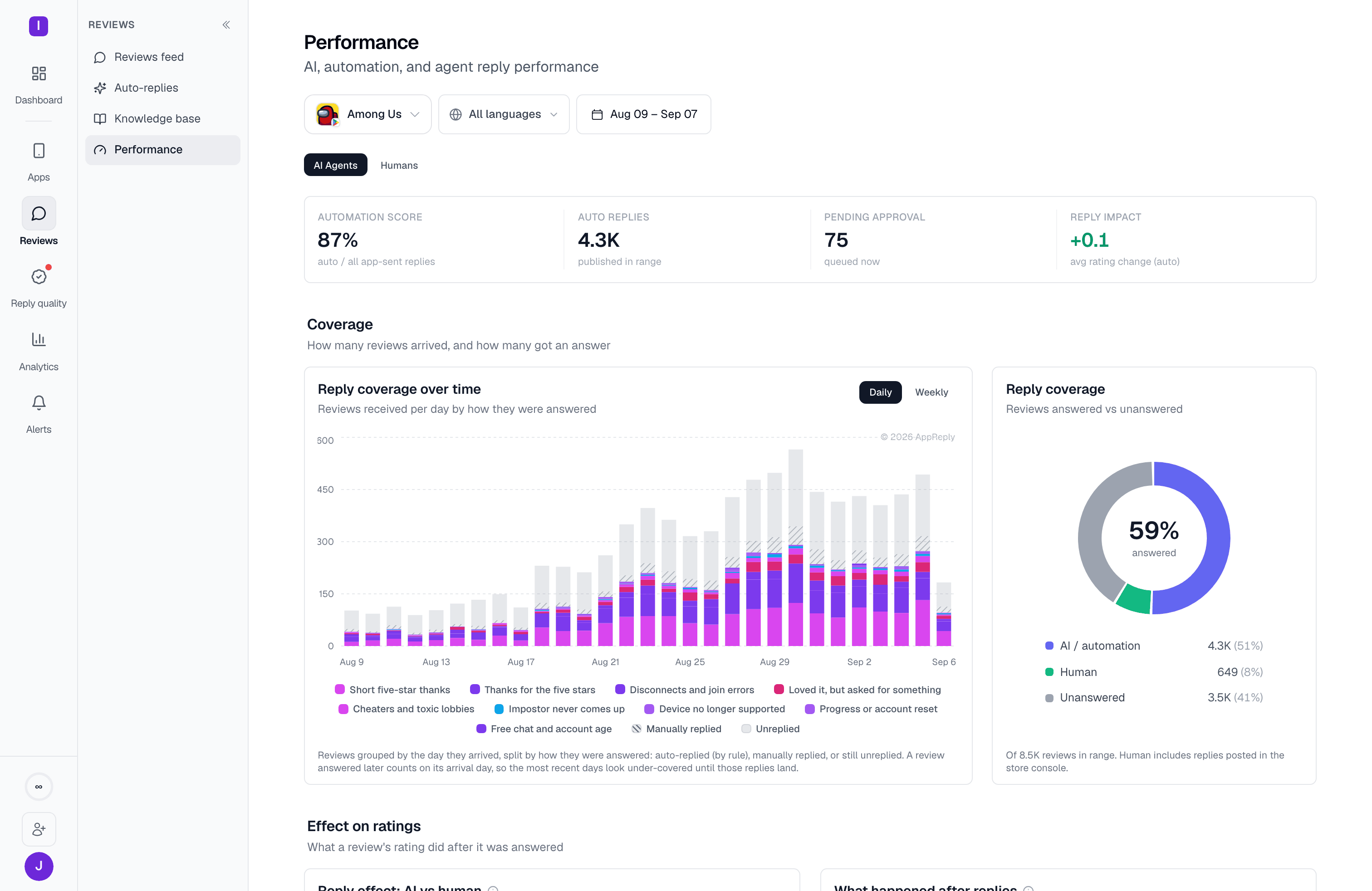
This tab opens with a summary strip of four numbers:
* **Automation score** — the share of your app-sent replies that were automated
* **Auto replies** — replies posted in the window
* **Pending approval** — replies queued now
* **Reply impact** — the rating effect of automated replies
Below the strip, three bands go from coarse to fine detail:
### Coverage
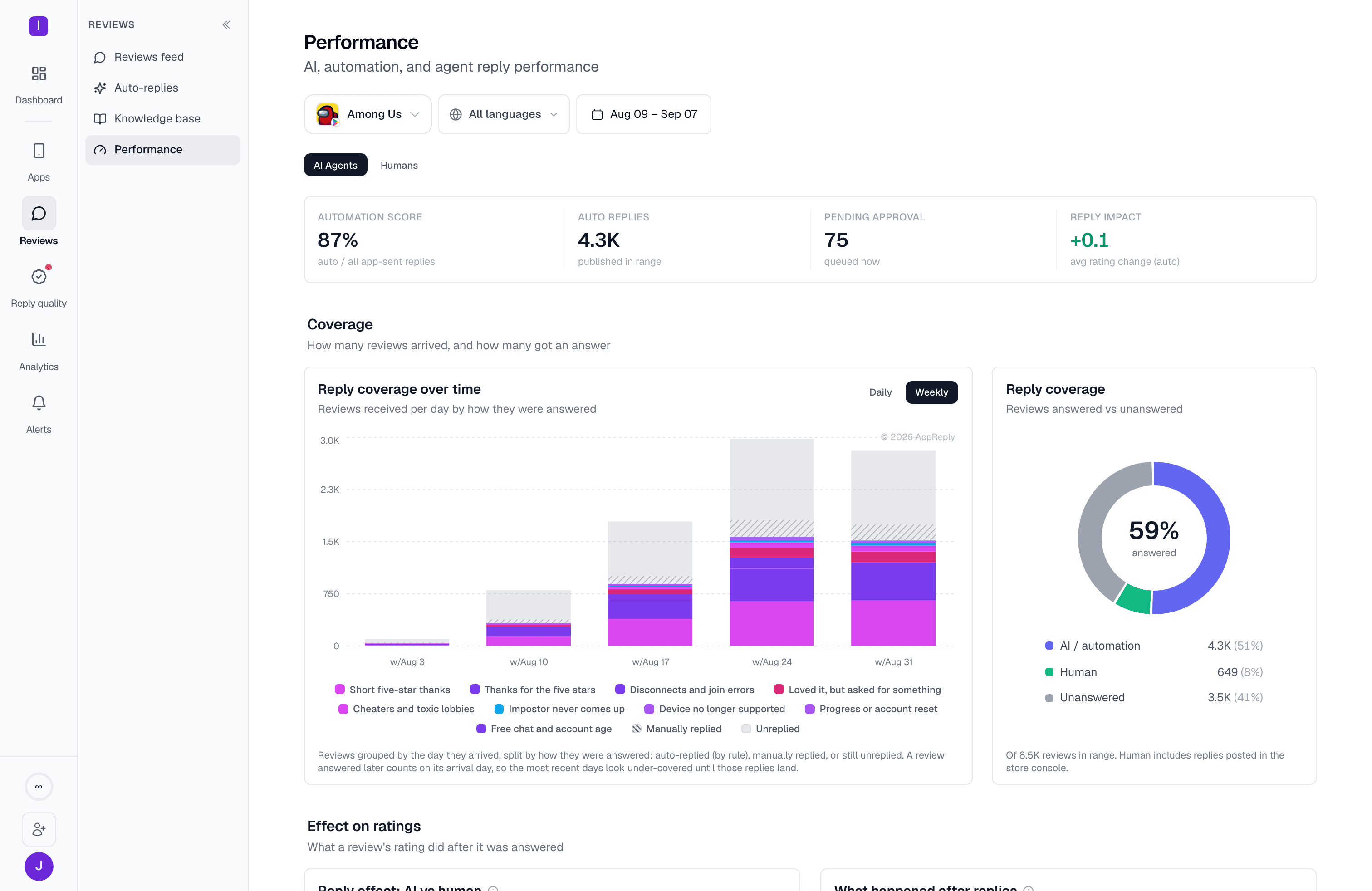
A time-series chart tracks daily reply coverage: how many reviews arrived, and how many got an answer. Next to it, a **reply coverage** donut shows the same split (answered vs. unanswered) for the window. The time series can be viewed aggregated by day or rolled up **weekly**, which smooths day-to-day noise on a longer window. For a window of 28 days or more, the chart opens on weekly. Your own Daily or Weekly choice sticks until you pick a window with a different default.
The chart's legend lists the ten busiest rules, then a **+N more rules** toggle (**Show fewer** collapses it again). The cap never hides the **Manually replied** and **Unreplied** keys.
Both tabs require a Pro or Ultimate plan (or an active trial); other orgs see an upgrade prompt in place of the charts. The **Humans** tab is additionally visible to Admins and Owners only — Members see just the AI Agents tab, with no second tab shown.
Every number on this page is read per app and folded together, so a multi-app scope reports a true combined total rather than one app's numbers standing in for the rest.
## AI Agents tab
This tab opens with a summary strip of four numbers:
* **Automation score** — the share of your app-sent replies that were automated
* **Auto replies** — replies posted in the window
* **Pending approval** — replies queued now
* **Reply impact** — the rating effect of automated replies
Below the strip, three bands go from coarse to fine detail:
### Coverage
A time-series chart tracks daily reply coverage: how many reviews arrived, and how many got an answer. Next to it, a **reply coverage** donut shows the same split (answered vs. unanswered) for the window. The time series can be viewed aggregated by day or rolled up **weekly**, which smooths day-to-day noise on a longer window. For a window of 28 days or more, the chart opens on weekly. Your own Daily or Weekly choice sticks until you pick a window with a different default.
The chart's legend lists the ten busiest rules, then a **+N more rules** toggle (**Show fewer** collapses it again). The cap never hides the **Manually replied** and **Unreplied** keys.
 ### Effect on ratings
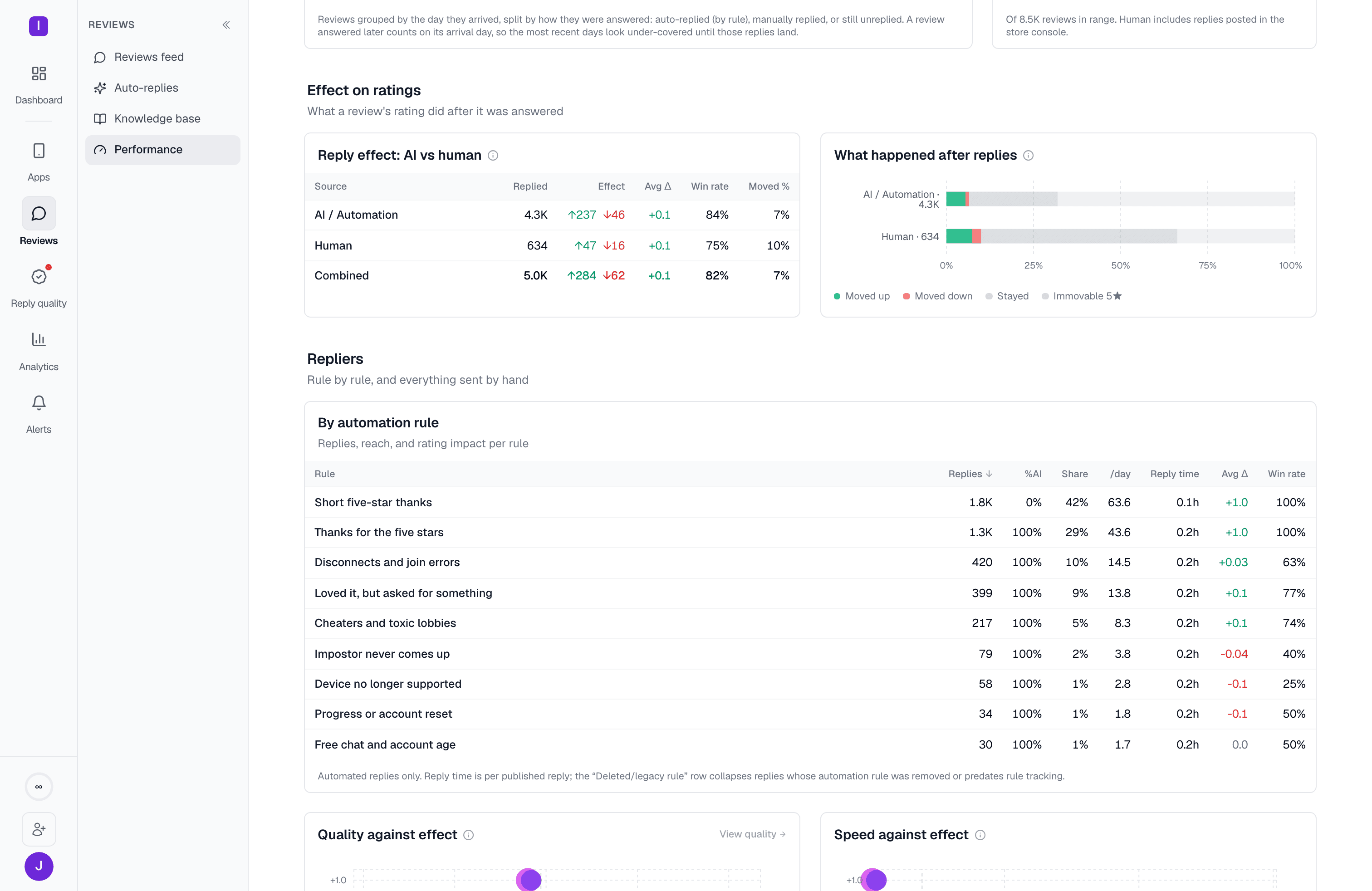
A table shows what a review's rating did after it was answered, split by **AI/Automation**, **Human**, and **Combined** reply source. Each row shows replies published, how many reviews moved rating, the average rating change, and a win rate (the share of moved reviews that went up). A second card breaks every reply down by outcome — whether the rating rose, fell, or stayed the same — as a share of that source's replies. Immovable 5★ reviews (5★ before and after) are counted here but can't meaningfully move a rating.
### Effect on ratings
A table shows what a review's rating did after it was answered, split by **AI/Automation**, **Human**, and **Combined** reply source. Each row shows replies published, how many reviews moved rating, the average rating change, and a win rate (the share of moved reviews that went up). A second card breaks every reply down by outcome — whether the rating rose, fell, or stayed the same — as a share of that source's replies. Immovable 5★ reviews (5★ before and after) are counted here but can't meaningfully move a rating.
 ### Repliers: by rule, by quality, and by speed
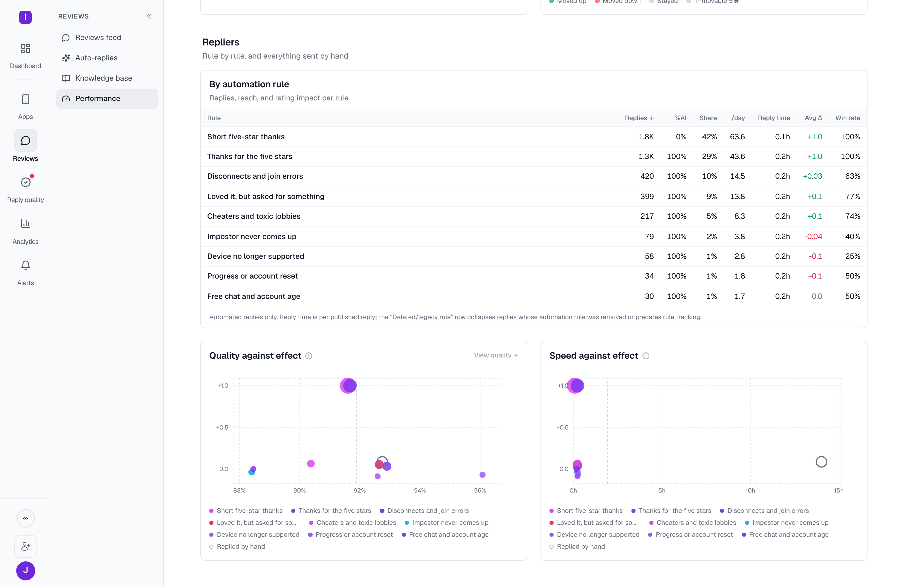
An **Automation-by-rule** table lists every automation rule that sent replies in the window, so you can see which specific rules are actually moving ratings, not just which are running most often:
| Column | What it means |
| - | - |
| Replies | Replies created by that rule in the window |
| AI share | Share of the rule's replies that used AI (rephrase or translation) |
| Share | Share of all auto-replies this rule accounts for |
| /day | Replies per active day |
| Time to publish | Average time to publish, including store moderation delay |
| Rating change | Average rating change |
| Win rate | Share of moved reviews that went up |
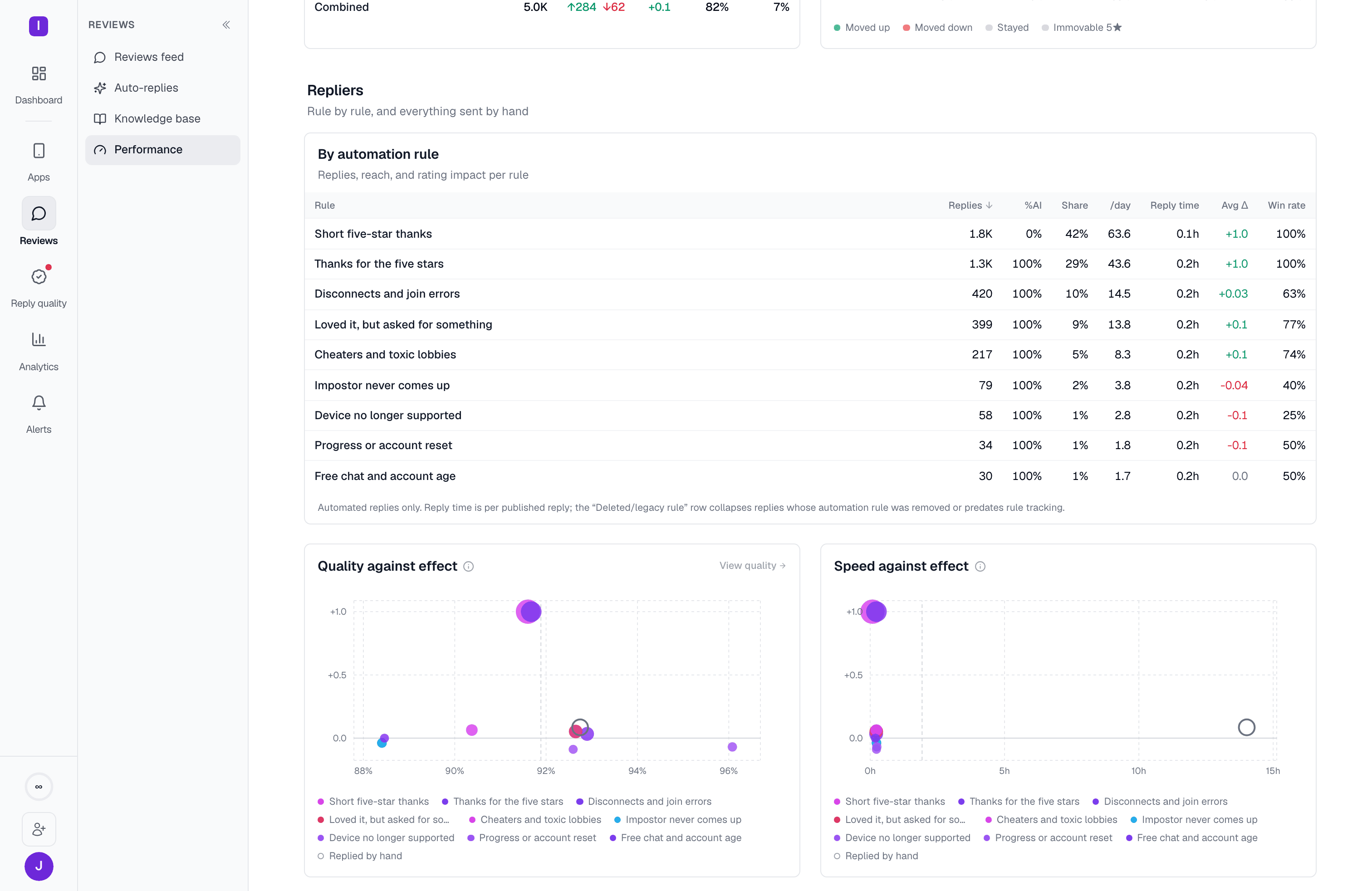
Below the table, two scatter charts plot every rule (and your hand-written replies, shown hollow) against the same rating-change axis:
* **Quality against effect** — each replier placed by how often its replies pass your reply-quality scorecard (left to right) against the rating change that followed (bottom to top). Dot size scales with replies sent; a dashed line marks the account's own overall pass rate.
* **Speed against effect**: the same layout, placed by mean time to reply instead of pass rate. A dashed line marks the account's own average reply time, drawn only once every replier's time is known. Its legend is capped at ten rules with the same **+N more rules** toggle.
A replier needs enough graded or timed replies before it gets a plotted rate; repliers that don't clear that bar are counted in the chart's key instead, with the reason available on hover.
### Repliers: by rule, by quality, and by speed
An **Automation-by-rule** table lists every automation rule that sent replies in the window, so you can see which specific rules are actually moving ratings, not just which are running most often:
| Column | What it means |
| - | - |
| Replies | Replies created by that rule in the window |
| AI share | Share of the rule's replies that used AI (rephrase or translation) |
| Share | Share of all auto-replies this rule accounts for |
| /day | Replies per active day |
| Time to publish | Average time to publish, including store moderation delay |
| Rating change | Average rating change |
| Win rate | Share of moved reviews that went up |
Below the table, two scatter charts plot every rule (and your hand-written replies, shown hollow) against the same rating-change axis:
* **Quality against effect** — each replier placed by how often its replies pass your reply-quality scorecard (left to right) against the rating change that followed (bottom to top). Dot size scales with replies sent; a dashed line marks the account's own overall pass rate.
* **Speed against effect**: the same layout, placed by mean time to reply instead of pass rate. A dashed line marks the account's own average reply time, drawn only once every replier's time is known. Its legend is capped at ten rules with the same **+N more rules** toggle.
A replier needs enough graded or timed replies before it gets a plotted rate; repliers that don't clear that bar are counted in the chart's key instead, with the reason available on hover.
 ## Humans tab
The Humans tab (labeled "Humans" next to "AI Agents") swaps the automation-rule view for a per-person one: who on your team is replying, how fast, and what happens to ratings afterward.
## Humans tab
The Humans tab (labeled "Humans" next to "AI Agents") swaps the automation-rule view for a per-person one: who on your team is replying, how fast, and what happens to ratings afterward.
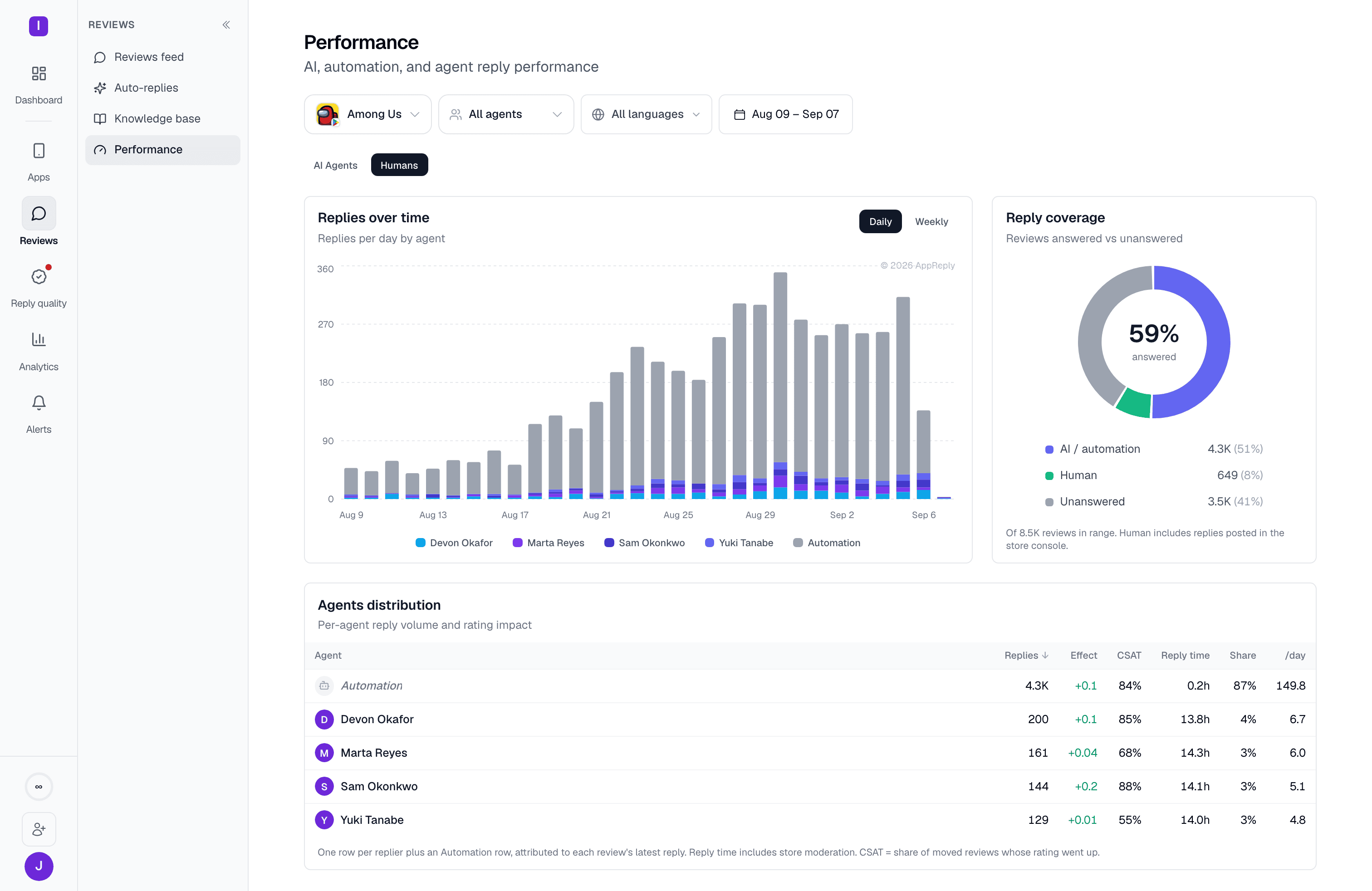 It opens with a **Replies over time** chart (one line per teammate, opening on weekly for windows of 28 days or more) next to the same reply-coverage donut used on the AI tab, then an **Agent leaderboard** table with, per person:
| Column | What it means |
| - | - |
| Replies | Replies submitted in the window |
| Effect | Mean rating change over reviews that could move |
| CSAT | Share of moved reviews whose rating went up |
| Reply time | Average time to publish, including store moderation delay |
| Share | Share of all replies sent in the window |
| /day | Replies per active day |
An agent selector in the filter bar (visible only on this tab) lets you narrow the chart and leaderboard to specific teammates.
How the shared filter bar and plan gating work across all of Analytics
See the store rating trends these reply numbers are meant to move
It opens with a **Replies over time** chart (one line per teammate, opening on weekly for windows of 28 days or more) next to the same reply-coverage donut used on the AI tab, then an **Agent leaderboard** table with, per person:
| Column | What it means |
| - | - |
| Replies | Replies submitted in the window |
| Effect | Mean rating change over reviews that could move |
| CSAT | Share of moved reviews whose rating went up |
| Reply time | Average time to publish, including store moderation delay |
| Share | Share of all replies sent in the window |
| /day | Replies per active day |
An agent selector in the filter bar (visible only on this tab) lets you narrow the chart and leaderboard to specific teammates.
How the shared filter bar and plan gating work across all of Analytics
See the store rating trends these reply numbers are meant to move